![Advanced Portfolio [Elliott, Ziaul, Keelan]](https://blogger.googleusercontent.com/img/b/R29vZ2xl/AVvXsEhc9HXgDtI9wcruaR4vodp1qAt9VYWwfo1RbL6YzVVRkTUb1J2bGm4EtEaNASxVkdamH6CcISa45M8XQ3sCPZPnIRWcToFd0gY7RwHUiiKnI1PydxM8QGxA70GqOLDO2I-w-Ws3Nyrx3jsh/s1600/blog+banner2k13+2.png)
It is here.
I have remastered this final version after feedback from our media tutor, to ensure there is no copyrighted material included. The main change is that the song featured in the very opening scene has been replaced with my (quite heavily) remixed version of a cover. While I was reworking this I also made a few changes:
Colour correction tweaked throughout, tracking shots stabilised (check the difference in the opening pan shot along the floor at 10 seconds in), got rid of camera whir when zooming and opening shot lengthened.
You can watch the video as it was meant to be (with original music) as well as see the feedback here:
http://www.youtube.com/watch?v=jivmQMncCXw
Was the hype real? leave a comment to let us know.
Sources for the soundtrack of High Stakes:
Sources for the soundtrack of High Stakes:
- Our blog post detailing how I chose the soundtrack - http://advancedportfolio201365.blogspot.co.uk/2013/10/musical-tone-and-style-elliott.html
- Opening music (from 0:10) is my heavily remixed version of Gary Redick's practice performance of the original by Peter Wingfield - http://www.youtube.com/watch?v=phRCrbMZxhI
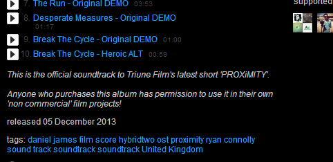
- Tension music and soundscapes featured throughout from Daniel James - http://hybridtwo.bandcamp.com/album/proximity-ost
This Screenshot shows that because Daniel James and Ryan Connolly are supporting the short film community they allow anybody who has bought the OST (at a bargain price) to use it, as long as they are not running a commercial project. I found this album through Ryan's film-making channel which I have been watching for a few years.
- Poker Jazz music (from 2:25) is a cover by Jose Tremontini of Frank Sinatra's original. He said that to use it as long as I accredited it, which I made sure to do in the credits for the short - http://www.youtube.com/watch?v=mmZjRYN0A7g
- Atmospheric Ending music (from 6:55) is an original from a user called artimybelov (he's French) the video says it is copyright and royalty free for any non-profit use - http://www.youtube.com/watch?v=wBq0fagNe4Y


