Wednesday, 12 February 2014

Evaluation - Ziaul


1. In what ways does your media product use, develop or challenge forms and conventions of real media products?


LWL review, Poster and film.

The task we were given was too make 3 film media products which included: film poster, film review and short film. We also carried out research planning for all three of these, as well as consistently improving our blogs. A short film can range from as little as two minutes too 10 minutes each with different plot, story-lines and genres. As well as the ancillary product (the short film) we had to also concentrate on making a brilliant film review and poster. Our group did a certain amount of research and all created our own poster, however only one being the final product. All media products have conventions which allow audiences to be able to identify what they are. For the media products we had to create they all had typical conventions which we had to follow. These conventions can tell audiences what to expect in the film they are about to watch or tell audiences the genre when they are watching the film. These conventions can relate to the content of the media, such as articles, character stereotypes or the medium such as film or magazines. These conventions exist across all media platforms. Although conventions may differ slightly in different media products depending on content, purpose and audience. I think the fact that the main protagonist of our film was Asian already challenges the conventions of thriller but also any film, because finding a film where the main character is Asian is very rare. Our main character is played by an Asian, this is unusal in most types of thrillers because film directors usually tend to keep with people of White or Black efnicity. Asian people generally are precieved as a weaker efnicity or terrorists during films and not an protagonist. I have not seen many films where an Asain plays a hero.

Only since the last ten years have Asian people been represented in a better way. The hit 'Bend it like Beckham' was the first time where the main character was a female Asian. This was a huge stepping stone for more Asian, not just females but also males try to get more lead roles within big films. A poll BBC conducted shows that 78% of people think that ethnic minorities are better represented on television now compared to 10 years ago. A clear indication as to how far people for different efnicity have come in the world of film. Before 1980's, Asian people were never on T.V, during the 80's the slowly came on T.V, but they were not given major roles, only small roles and stereotyped as; corner shop owners; taxi drivers; restaurant owners.

On September 11th 2001, one thing happened that would change everyone’s perceptions of Asian people: suicide bombers crashed into the twin towers (in America, New York), causing total devastation and hatred between white and Asian communities. After that Asian people were labelled as terrorists, suicide bombers, being stopped by police just because they were Asian. On 7th July 2005 another attack happened but this time in London. 7 main stations were bombed in London and a bus which just fuelled the hatred for Asian people. There were a series of shootings and stabbings aimed at black people and they were killed. The media attacked it and made people believe that all Asians for at fault.

Clearly shown as evil and bad.

Sunday, 5 January 2014

A2 Media Evaluation - Elliott

1. In what ways does your media product use, develop or challenge forms and conventions of real media products?

Me and my group have created 'HIGH STAKES' a 5 minute (and then some) short film, in which we have used, abused and subverted the conventions, forms and preconceptions of the film-going audience and real media products.

I will use this 9-panel format to analyse our short. (introduced by Art of the Title)
I've put up a larger version of this file, which you can download in full 4K resolution, here

2. How effective is the combination of your main product and your ancillary tasks?


Video link in case embedding goes nuts - https://www.youtube.com/v/dqJDvoPmTso
Watchmen title sequence 240p - http://www.youtube.com/watch?v=iVyLG4MY1h4
High quality film poster - http://advancedportfolio201365.blogspot.co.uk/2013/12/final-film-poster-elliott.html 

Transcript of my video analysis:
I believe that overall my portfolio would work very well in a real commercial context. I have tried to tie my products together through the use of synchronicity between the different media platforms, in what I hope is a very similar way to how large film companies do.
One way I have done this is by trying to build a brand or in-house style between my poster and short film products.

Doing this helps to make the products more recognizable to an audience and to make the product stand out in their minds, by associating a visual style to the film. This means that whenever a consumer sees a similar style – be it font or otherwise, they have a chance of remembering the film and therefore being more likely to see it.
One good example of this purposeful correlation is the film Watchmen which uses a bold, yellow font in both its poster and title sequence (as well as lots of promotional material.) This gives a huge impact to the posters, that also give the audience context clues about the movie, such as using the blue-green gradiented colour style that has become synonymous with the thriller genre. I will link to Watchmen’s excellent title sequence but it can be found in much better quality on the more illegal side of the internet.
Through my research on big budget film titles I have noticed that action films and thrillers tended to use large bold fonts to reflect their, mostly male, target audience. As that is the same audience that my short hopes to target I have followed this convention in picking the very impactful font that combines our film and poster.
Through all of our poster ideas we chose to pick the one that represents all three characters as we wanted the poster to give a vague idea of what the plot could be. I also liked the symmetry of the protagonist flanked on either side by the film’s antagonists. Following the common sense and film conventions, ‘Franklin’ is centered, enlarged and physically in front of the two backing characters. This is to show that he is more prominent and features as the focal point of the story.

My group decided that screen-shotting scenes from the movie would deduct from the professional look of the poster, and so to get higher-quality images we took dedicated photos specifically for the poster, this meant I could tailor the images to convey the exact messages I wanted, such as giving Matt’s character an aggressive pose to show he is the more brash of the two antagonists.
To further enhance the correlation between our poster and film brand (and partly to justify the hours I spent editing them) I decided to use the same photos in the credit sequence for the film. Another touch I was particularly keen on is the website I put on the poster; most short films use their website as the prime means of advertisement and yet most A level posters feature a made up website address. The website I made for the poster links directly to the group blog where people can watch the whole film or read the review.
I felt that using a red spade in the stylised title helped subtly link the poster to the gambling theme of the movie, as well as causing enigma among members of the audience who recognise the contrapuntal nature of the sign. Both film and poster also feature the same logo for Zeppelin production group (the moniker my group adopted.)

It was difficult to link the review into our brand because of the differing audience of Little White Lies. Whereas an audience member for our film is most likely to be an under 25, working class male, the average reader of the review magazine is a typically wealthy older male. In this case it was important to aim at the typical reader demographic because that is the in-house style of Little White Lies, however doing so probably would fail to attract our target audience because of the differing writing styles that appeal to the two. To make up for this necessary discrepancy we decided to include references to the Zeppelin production group in the review, which makes sure the reader knows the review is a part of the film’s branding. This was the best way to correlate the ancillary tasks while maintaining the formal language that is commonplace in a review of this nature.

I think that, on the whole, the ancillary tasks succeed in supporting the film because of the many factors we have spread across all three platforms, and because each medium gives the audiences just enough of an insight into the film that they may just be interested enough to give it a watch. The poster certainly helped in attracting attention when we were looking for audience feedback.

Saturday, 4 January 2014

A2 Media Evaluation [Keelan]

For our A2 Advanced Portfolio we had to create a short film, lasting roughly five minutes, a poster for the short film, as well as a review for it. Before creating the short film, which we have named 'High Stakes', we had to undertake a lot of research and planning to ensure that it was effective in using, developing, and challenging forms and conventions of real media products.

1. In what ways does your media product use, develop or challenge forms and conventions of real media products?

Short Film


(9 frame analysis of the short film)

Our short film mainly conformed to the conventions of a short, thriller film, rather than challenging them. Short films are notorious for belonging to more than one genre, as well as actually not being able to be placed into a genre, this way they are very unique. However, most all contain common conventions such - 

- Editing / post-production
- Themes and issues
- Use of genre conventions
- Mise en scene
- Sound
- Camerawork
- Characterisation
- Narrative organisation and the short film format


Narrative organisation and the short film format

- In High Stakes we have one protagonist, as per most thrillers. It is clear throughout the short film that this gentleman is the main character (shown in shots 2, & 8 of the 9 frame analysis).

- We have both conformed and challenged typical conventions of a thriller short when it comes to the antagonist as we have two characters who take on this role, rather than just one individual.

Whilst researching into how we would create our short film to either use, develop or challenge forms and conventions of real media products we analysed several different theories by well known, knowledgeable media theorists. 

- One theorist that we researched was John Hartley, with his theory named 'The Hartley Classification'. This theory suggested that institutions produce "Invisible fictions of the audience which allow the institutions to get a sense of who they must enter into relations with", this meant that the people creating the media product, in our case a short film, must understand their audience in order to target them effectively.

- Our target audience for our short thriller film was people among our own age range, ranging from  15/16 to 20. Therefore we fully understood our target audience, allowing us to conform to a proven theorists narrative theory.

- We also challenged a common conventions of a thriller short film through the use of dialogue, or in fact lack of. This was done by using a rather minimal amount of dialogue, this is quite unheard of as with short films, as much information is usually put across to the audience as possible, due to time limitations. This complies to what a popular theorist, Steve Neale said, that pleasure is derived from 'repetition and difference'. Meaning that narrative should conform to common narrative conventions, as well as challenging to differentiate from others.
 

Thursday, 19 December 2013

Final short film - Elliott

It is here.


I have remastered this final version after feedback from our media tutor, to ensure there is no copyrighted material included. The main change is that the song featured in the very opening scene has been replaced with my (quite heavily) remixed version of a cover. While I was reworking this I also made a few changes:
Colour correction tweaked throughout, tracking shots stabilised (check the difference in the opening pan shot along the floor at 10 seconds in), got rid of camera whir when zooming and opening shot lengthened.

You can watch the video as it was meant to be (with original music) as well as see the feedback here:
http://www.youtube.com/watch?v=jivmQMncCXw


Was the hype real? leave a comment to let us know.


Sources for the soundtrack of High Stakes:
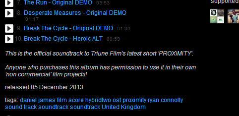
This Screenshot shows that because Daniel James and Ryan Connolly are supporting the short film community they allow anybody who has bought the OST (at a bargain price) to use it, as long as they are not running a commercial project. I found this album through Ryan's film-making channel which I have been watching for a few years.

  • Poker Jazz music (from 2:25) is a cover by Jose Tremontini of Frank Sinatra's original. He said that to use it as long as I accredited it, which I made sure to do in the credits for the short - http://www.youtube.com/watch?v=mmZjRYN0A7g 
  • Atmospheric Ending music (from 6:55) is an original from a user called artimybelov (he's French) the video says it is copyright and royalty free for any non-profit use - http://www.youtube.com/watch?v=wBq0fagNe4Y

Wednesday, 18 December 2013

Final Film Review - Keelan


Alternative film poster - Zool


 We have tried our utmost to get the raw emotion, feisty, grittiness within one image, I hope we have done that. As you can also tell he has a sadistic stare with adds to the enigma we wanted to give out.This Is an alternative to the proper film poster but is everything we could have hoped for plus more.

The Most Compelling Shot In Our Short Film [K-Biggles]

One hour of pure fist bumping (fisting)